
In a digital product, the overall experience users feel is UX (User Experience); what they see and touch is UI (User Interface). They complement each other: without strong UX the interface feels random; without strong UI a well-planned experience cannot be implemented. This article explains what UX and UI are, how they differ, core principles, popular libraries and why Veltstack uses shadcn with Lightswind.
What Is User Experience (UX)?
UX (User Experience) covers the overall feeling, ease and satisfaction a user gets from interacting with a product. It is not only about looks; whether users reach their goal quickly, get stuck filling a form, find the information they need and trust the site all fall under UX.
The UX process includes user research, personas and scenarios, information architecture, wireframes, prototypes and usability testing. Outputs are sitemaps, user flow diagrams and approved prototypes; development is built on that plan.
Good UX reduces unnecessary steps, offers clear guidance, makes error states understandable and delivers a consistent experience on every device.
What Is User Interface (UI)?
UI (User Interface) is the visual and functional layer where users interact with a product. A navigation bar, CTA button and contact form on a website; tab bar, list cards and login screen in a mobile app are UI elements. Good UI is readable, consistent, accessible and reflects brand identity.
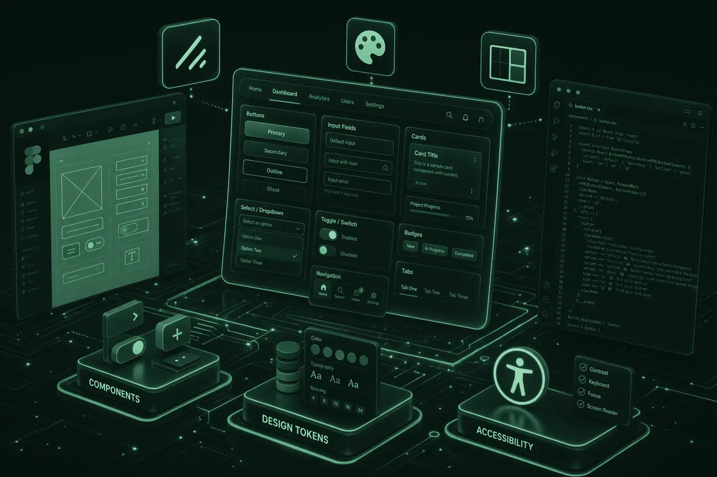
UI development combines HTML/CSS structure, React components, utility-first CSS frameworks such as Tailwind CSS, and ready-made UI libraries such as shadcn and Lightswind.
UX vs UI
| Aspect | UX (User Experience) | UI (User Interface) |
|---|---|---|
| Focus | User journey, flow, information architecture | Visual design, components, interaction detail |
| Question | "Can the user reach their goal easily?" | "Is the interface readable, consistent and trustworthy?" |
| Tools | Figma, user testing, wireframes | Shadcn, Lightswind, Radix UI, Chakra, HeroUI... |
| Output | Sitemap, flow diagram, prototype | Button, form, modal, card, navigation |
| Relationship | UI without UX looks random | UX cannot be implemented without UI |
Where rooms sit, how corridors connect and how the user reaches their goal is planned.
Wireframe, user flowWall color, door handles, lighting and furniture; every detail the user sees and touches.
Button, typography, color paletteCore Principles for Good UX
- Know your users: Target audience needs, motivations and friction points should be clarified through research and feedback.
- Clear information architecture: Menu structure, page hierarchy and content grouping should help users find what they need quickly.
- Fewer steps to the goal: Critical flows such as getting a quote, signing up or purchasing should minimize unnecessary fields and pages.
- Understandable feedback: Loading, error and success states should guide users without leaving ambiguity.
- Accessibility: Keyboard use, contrast and screen reader support apply to the whole experience, not only UI.
- Continuous testing: Assumptions should be validated through usability testing on prototypes and live products; improvement should be ongoing.
What Is a UI Component Library?
A UI component library offers ready-made or semi-ready interface pieces such as buttons, inputs, modals, dropdowns, tabs and cards. Instead of writing every button from scratch you use tested, accessible components; development speeds up and consistency improves.
Two main approaches stand out:
- Styled UI kit: Components with built-in look.
- Headless + styling: Behavior and accessibility ready; you customize appearance with your own styles.
Popular UI Libraries
| Library | Type | Strength | Best for |
|---|---|---|---|
| shadcn | Headless | Full control, copy-paste | Next.js, brand-unique projects |
| Lightswind UI | Animation | Micro-animations, transitions | Hero, landing, premium feel |
| Radix UI | Headless | Accessibility, flexibility | Building a custom design system |
| Chakra UI | Styled kit | Fast setup, theme API | Admin panel, internal tools |
| HeroUI | Styled kit | Modern look, theming | Quick MVP, dashboard |
| Material UI | Styled kit | Google Material Design | Enterprise, data-heavy panels |
| HyperUI | HTML snippet | Zero dependency, fast | Landing page, static sections |
| Headless UI | Headless | Flexibility, customization | Custom-styled React projects |
| Mapcn | Map UI | MapLibre-based location components | Contact page, store finder, routes |
Why We Choose shadcn and Lightswind
- Code ownership: Components are copied into your project, not locked in
node_modules; edit freely. - Radix UI-based accessibility: Keyboard navigation, focus trap and ARIA roles come ready.
- Design tokens: Central token structure for consistent spacing, color and dark mode.
- Next.js integration: Works smoothly with Server and Client Components; clean imports via barrel export.
- Premium look: Away from Bootstrap or generic kit appearance; brand-specific interface.
- Large ecosystem: Button, Dialog, Sheet, Tabs, Form and dozens more; grows with community contributions.
- Animation with Lightswind: Ready animated components for hero, cards and transitions; adds a premium feel quickly.
- Dual-stack fit: shadcn handles forms and navigation; Lightswind covers visual motion; both stay consistent via shared design tokens.
Core Principles for Good UI
- Consistency: Same button style, spacing scale and typography across all pages.
- Accessibility (a11y): Adequate contrast, keyboard access and screen reader support aligned with WCAG.
- Responsive design: Readable and usable interface on mobile, tablet and desktop.
- Dark mode: Light/dark theme per user preference; reduces eye strain.
- Feedback: Loading state, error messages and success notifications keep users informed.
- Performance: Avoid unnecessary animation and heavy components; protect Core Web Vitals.
Practical tip
Clarify UX flows with wireframes first, then refine UI design in Figma and implement with shadcn components. Add Lightswind components for animation and micro-interactions; map design tokens (color, font, radius) into your project.
Common Mistakes
- Jumping straight to visual design without UX research; user needs are assumed incorrectly.
- Complex menus and multi-step forms; conversion drops and support requests increase.
- Using a different UI library on every project; consistency and maintenance suffer.
- Adding accessibility late; prefer Radix UI/shadcn-based components and a Lightswind animation layer from day one.
- Too many colors and fonts; 2–3 primary colors and one font family are enough.
- Designing desktop-first and cropping on mobile; mobile-first needs less refactoring.
- Using a ready-made kit look without customization; brand perception weakens.
- Confusing UI and UX and focusing only on visual beauty; user flow stays broken.
Professional UX & UI Building
Strong UX and UI directly affect conversion, trust and brand perception. At Veltstack we work end to end from user flow planning to accessible interfaces for corporate sites, e-commerce and custom software, building premium, consistent experiences with shadcn, Lightswind and Radix UI.
Conclusion
UX defines the overall experience users have with your product; UI is the visible, interactive layer of that experience. When both work together users reach their goals easily, trust your brand and conversion improves. In modern web projects the right UX plan and UI library choice speed up development. At Veltstack we combine a UX-first approach to user flows with shadcn for core components and Lightswind for animation to build sustainable digital experiences.